
I started this project a few weeks ago. I didn’t like it much. But, I had already cut the fabric, so , I made a few adjustments. I was limited in the that Ihe things I could do since everything was already cut. I also did not have much extra fabric, which was odd for me. I usually buy way more than I need. Not quite finished, still have border of the solid green on the bottom and the top and an outer border. The outer border will have to be a different solid color since I have no more of the green.
My daughter does not like it. She hates the yellow. It does stand out a lot and the green print just disappears. It is still oddly intersting. I will have to see once I get it totally done. Not much left to do.
Also got my safari quilt pin basted and ready for the actual quilting. I need to figure out 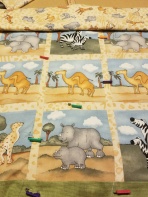 the exact pattern and practice a bit befiore I begin. I am also contempating making a storage bag for this quilt since I plan on saving it for my “someday” grandchild.
Happy Sewing
Happy Quilting

hmmm – I like the yellow but it’s rather bright compared to the other fabrics, and maybe would have looked better with a more symmetrical layout, than scrappy placing. I don’t know all the correct patchwork terms when referring to colours, but it looks like you’ve got lots of very dark fabrics, which all blend in together, and then the yellow.
LikeLiked by 1 person
I agree. A bit odd.
LikeLike
The yellow pinwheels do take your eye all around the quilt, though, and I like the odd placing of yellow in the centre square; three cornerstones and then a couple of odd ones. I think having so many yellow squares here and there in the outer border throws it off a little and draws your eye away from the pattern in the centre. I think it’s right to have some yellow in the outer border but I would go for smaller amounts, speckles of it or something, or thin strips or would triangles work? Or maybe just in the corners, echoing the centre square. Like you I do find it interesting to look at because it has movement. It’s alive.
LikeLiked by 2 people
Thanks for the ideas!
LikeLiked by 1 person
You are very welcome. Please do the same for me on my blog when you have suggestions that might be useful. I’d love to hear them.
LikeLiked by 1 person
I will do that Lesley!
LikeLike
I looked hard at the quilt before I read your comments and my thoughts were, I really like the bright yellow as it catches your eye and leads you all around. I think it is a lovely quilt and the yellow sets it off.
LikeLiked by 3 people
Thanks Peggy!
LikeLike
I read everybody’s comments after reading your post and then studied the quilt for a while. Have you considered auditioning more of the YELLOW for a NARROW framing border next to your wider green border that you have on now? By using the bright yellow again, it should draw your eyes out to the frame and give it more continuity, and balance things out I think. Then follow the narrow yellow with your darker color for your outer border. I’d love to see your planning stages as you audition fabric choices to finish this quilt. I agree with Peggy that it catches your eye and leads you around. (I am a yellow fabric person, because I find it makes things cheerful, and I think it pops you otherwise dark quilt.) Stitch on!
LikeLiked by 3 people
I got so absorbed by the yellow, I wanted to comment on your safari quilt. Are you long arming or FMQ? My instinct would be to “outline” the animals and the clouds so they pop, and do some small tight micro stippling in the sky, and pebbles on the ground. Just a thought!
LikeLike
FMQ. I love your ideas. Thank you so much.
LikeLiked by 1 person
I love Yellow also. I have no more of the yellow print, but I could use a solid yellow. I think that might work. Thanks!
LikeLiked by 3 people
I agree – to stop the green and dark colors, brighten it up with yellow border – OR if you really like to rip, take off the plain green side strips and make a border with the greens, etc like the top and bottom and then add a nice yellow border the same size as the top and bottom – does this make sense to you?
OR take off the top, bottom and side borders, add a border 1/2 the size of the pinwheels. That will stop all the dark and brighten it up. OK – back to looking for the gnomes!
LikeLiked by 1 person
LOL. Went out at lunch and got some yellow. We will soon see what it looks like…..Thanks Nanette!
LikeLike
I had to learn contrast in colors and what it can do to a quilt. Values are another thing that I had to learn the hard way – did a Storm at Sea – 3 colors I thought it was a Blue Ribbon quilt in 2010 that did not happen because another quilt won because they used color values that provided ‘movement’ to the quilt. I then took an online course and learned “value”. I made 2 color wheels out of batiks. One called the Ives Color wheel that has 24 colors and the regular one – think it has 12. Anyway – it really helped. Joen Wolfrom has a book called “Color Play” It really helps a quilter learn about color and their values.
You might look for that one. I always try to “frame” my quilts. If I do a center, then I change the value and the color to “stop” the center, then move on. Once I finish the quilt, I then look for another “frame” to really put it altogether.
Have fun ripping if you decide to do that. Enjoy, Later
LikeLiked by 2 people
Thanks Nanette!
LikeLike
This happens to me sometimes too….a color palette or design looks good in my head, but once realized, I’m not so sure about it.
LikeLiked by 1 person
Thanks for sharing – I love to see the process in others. I was thinking more yellow in the borders like others have said.
LikeLiked by 1 person
I believe that is what I will do. Thanks Jodi!
LikeLiked by 1 person
Another good book is ‘The Quilter’s Practical Guide to Color’ by Becky Goldsmith, which covers a lot of stuff like tone and scale, value, contrast and clarity and includes skill building projects.
LikeLiked by 1 person
Thanks Lesley!
LikeLike
We will have you becoming a perfectionist on color Lori. Take care and enjoy the journey. Hugs
LikeLiked by 1 person
Thanks Nanette. Take care.
LikeLike
I like the yellow. It stands out and brightens up the whole quilt!
LikeLiked by 1 person
Thanks Mary
LikeLike
What would happen if you took out the squared pieced border at top and bottom…If you have enough of the green to stretch in there…or even a solid green or brown…then you could use those squares for cornerstones…I think it would help even out the yellow. I love the yellow color, but it does like to overpower things a bit…If you have no fabric that fits in those places, keep on keepin’ on…and good luck. I’m sure the finished quilt will be lovely…if not, you can have picnics on it or donate it;-).
LikeLiked by 1 person
While I don’t care for it, someone will or a charity quilt it will be. Thanks for the advice!
LikeLiked by 1 person
I like it! Personally, I like quilts that are are unexpected. Anybody can follow a magazine pattern or read a book and do what someone else says is best – re color or pattern or size. But I enjoy those that look more spontaneous, and this one has that look! Kudos. It’s a good pattern – did you design it? or is it someone else’s design?
LikeLiked by 2 people
Thanks. I would say it was inspired by another, design I saw, but changed to suit my needs. FInally working on some total originals.
LikeLiked by 1 person
I kinda like it!
Thanks for the follow!
LikeLiked by 1 person
Thanks for the kind words! Have a great weekend.
LikeLiked by 1 person
You’re so welcome.
LikeLiked by 1 person
The yellow really pops.
LikeLiked by 1 person
Thanks Sandy!
LikeLike